
Bedroom Pop to Hyperpop
Northey
2026
Socials
Spotify
Northey
2026
Socials
Spotify
Northey is a Toronto based independent producer/musician making music “for your girl”. Her catalog ranges from indie singer/songwriter to bedroom dream pop, all featuring her classically trained vocals and irreverent lyrics.
Since her last EP Winter Baby in 2024, northey has been exploring new sounds influenced by Y2K revival, hyperpops maximalist production, and emerging digicore sounds in alt pop. While her personal look has always been her own, she brought me on to her team to design what her logo might look like following her new sound.
Since her last EP Winter Baby in 2024, northey has been exploring new sounds influenced by Y2K revival, hyperpops maximalist production, and emerging digicore sounds in alt pop. While her personal look has always been her own, she brought me on to her team to design what her logo might look like following her new sound.


Through our exploration of the wordmark we landed on three options that range in legibility but all convey the same dominating, cute, and loud personality. Keeping the colours to simply three shades meant that we were able to play around with alt forms of each wordmark, and crucially, all of the logos could easily be stenciled/screenprinted/spray painted for merch, promotion, stage banners, etc.
This original wordmark exploration extended into the buildout of her upcoming EP 77 AURA release party and show merch as well as designing the album cover for 77 AURA.
MERCH
This original wordmark exploration extended into the buildout of her upcoming EP 77 AURA release party and show merch as well as designing the album cover for 77 AURA.
MERCH


I wanted to develop some merch specific assets, playing off the established logo wordmarks, and expanding the visual identity of the project's rollout. Pulling from Y2K imagery, I wanted to render the logos in early internet graphic styling ASCII - with the entirety of the image rendered in individual glyphs of a mono-spaced font. The outcome is crude and even less legible but highly expressive and represents the essence of the project. With the added benefit of being easily translated into a stencil or screenprint as most of the individual characters consist only of a single shape.
stream stupid boy feat. aegee
![]()
![]()

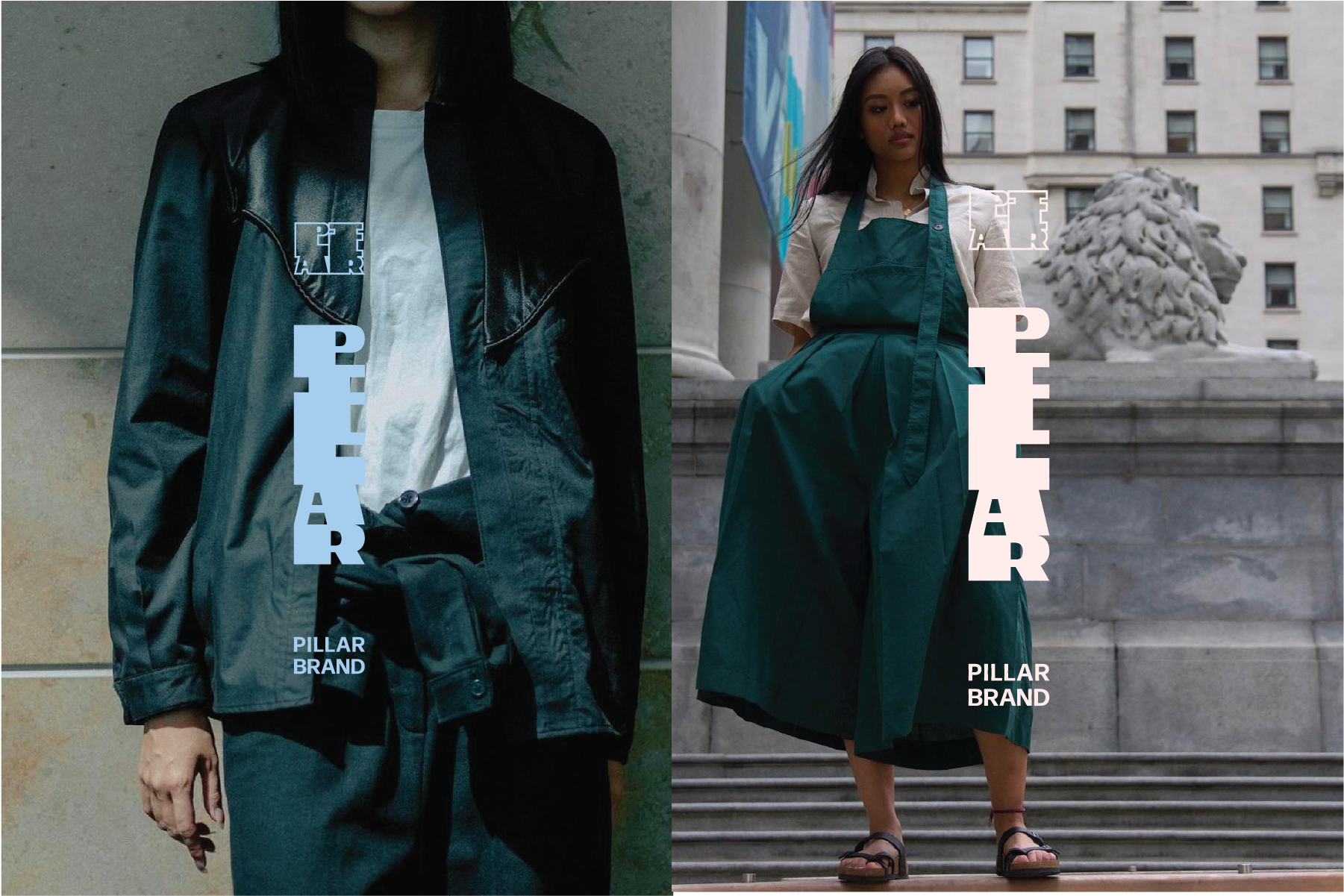
Started in Vancouver and relaunched in Toronto years later, Pillar is the fashion brand of designer and creative Eric Han. Erics designs draw from a wealth of inspirations but are consistently informed by heritage garments and melding distinct cultures to create wholly unique pieces.
In designing the brand, I wanted to develop a versatile suite of modular wordmarks and brand elements that could be used independently, or combined. Form had to be carefully considered in the development of this brand as in clothing and garment design, there are multiple applications where the brand could be inserted. Hang tags, zipper pulls, and clothing tabs were all forms that were considered for the vertical application. Nape tags, business cards, and signage were all considered when developing the primary logo in it’s variable widths. Creating distinct shapes, appealing colours, and brandmarks that would compliment and not pull focus from the garments were priorities in developing Pillar Brand.
In designing the brand, I wanted to develop a versatile suite of modular wordmarks and brand elements that could be used independently, or combined. Form had to be carefully considered in the development of this brand as in clothing and garment design, there are multiple applications where the brand could be inserted. Hang tags, zipper pulls, and clothing tabs were all forms that were considered for the vertical application. Nape tags, business cards, and signage were all considered when developing the primary logo in it’s variable widths. Creating distinct shapes, appealing colours, and brandmarks that would compliment and not pull focus from the garments were priorities in developing Pillar Brand.
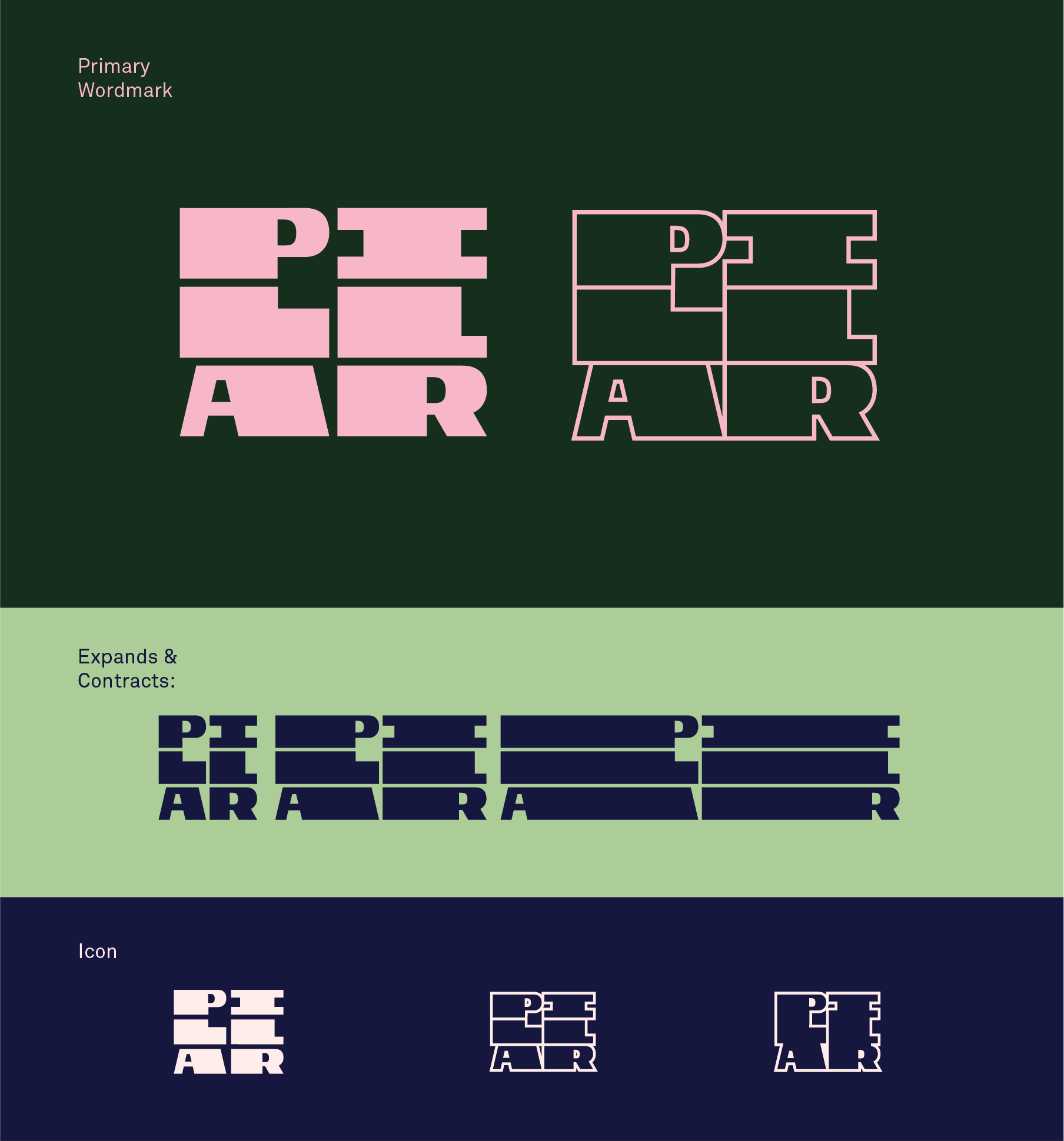
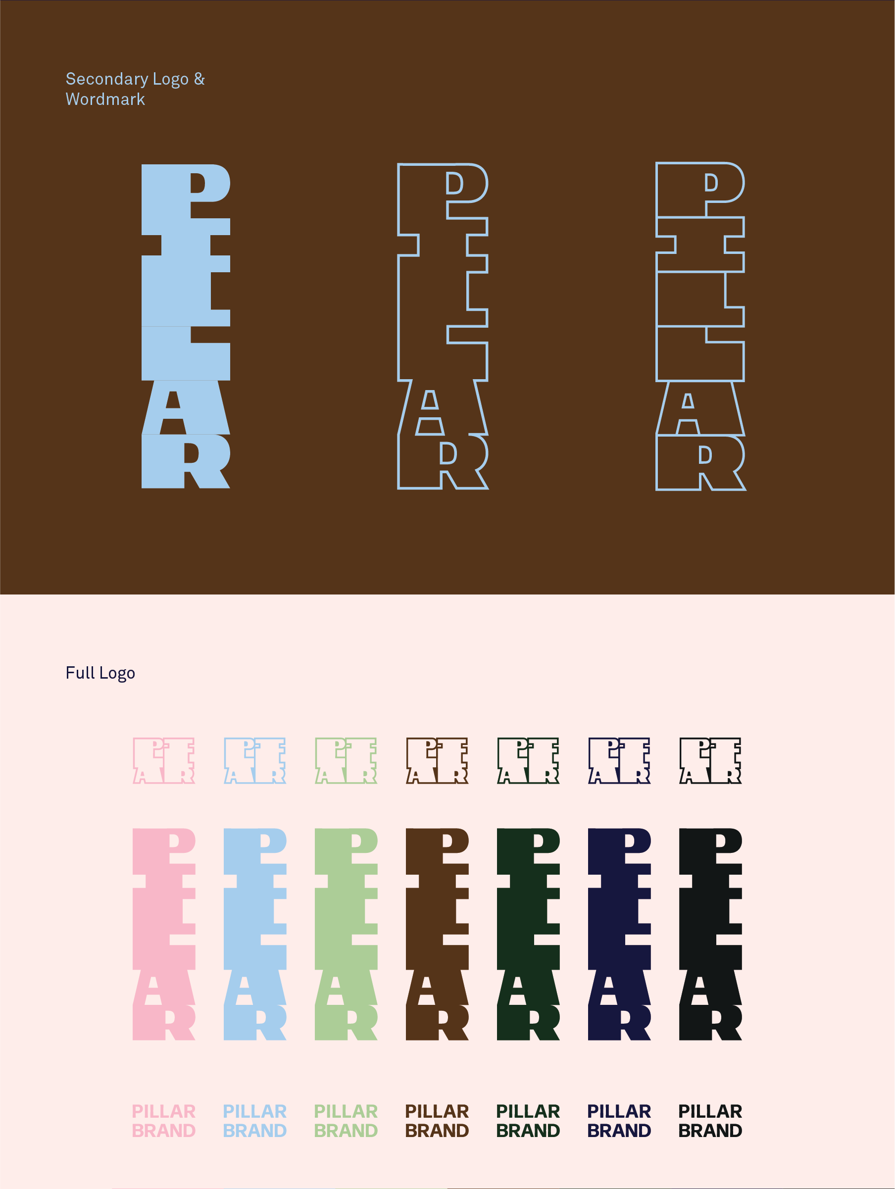


Initial Logo Pitches:


Pitch 01
implied logo mark
implied logo mark
Because the brand was reshaping itself and the designer/director wanted to explore so many topics, I wanted to offer a logo mark that was generally stylish but versitle. I wanted to pitch something modular that could be used across the brand, but reinvented with each collection.
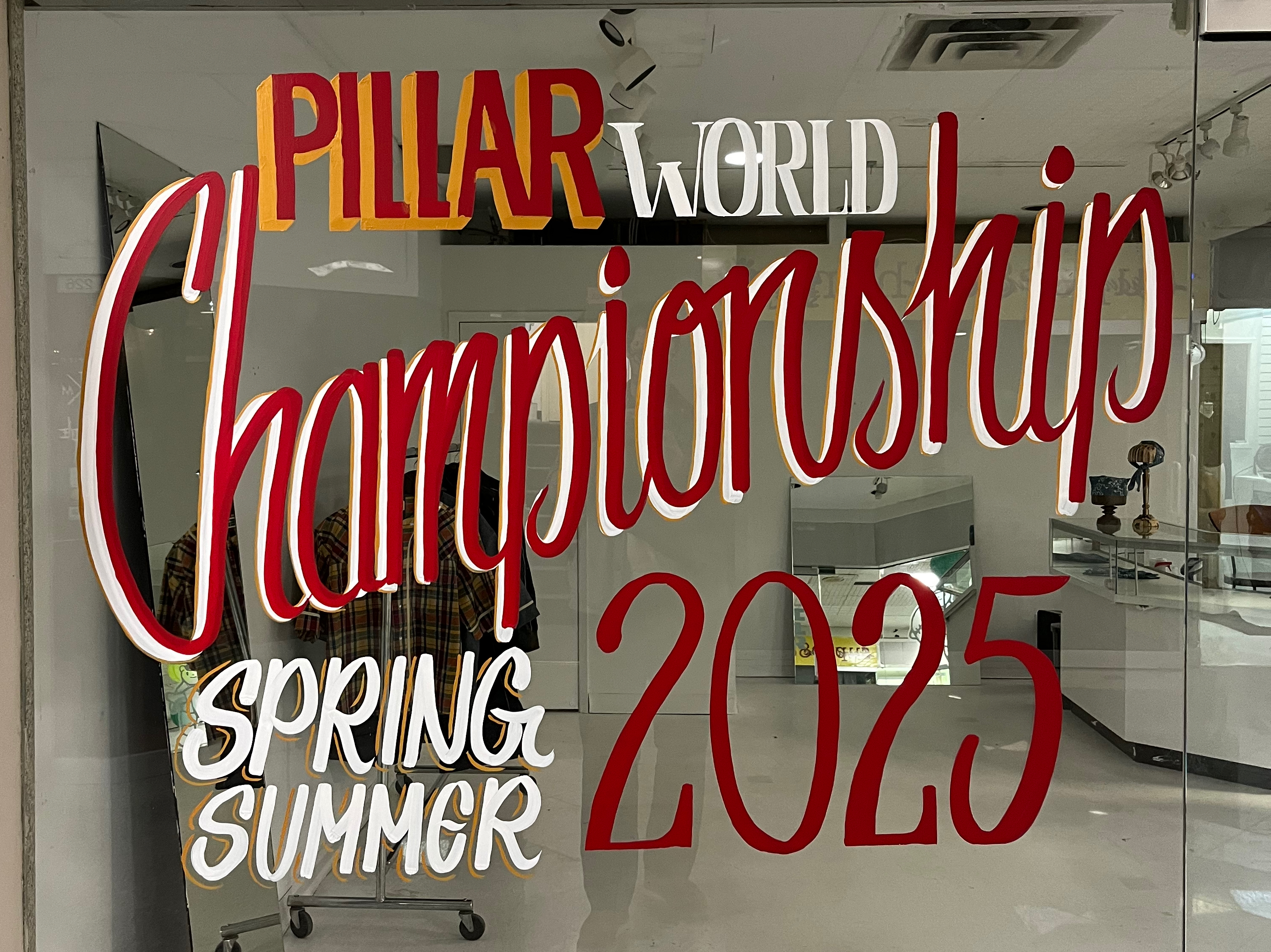
Pillar Brand Spring Summer 25’ Signage
2024
The Pillar Spring Summer 2025 line pulled inspiration from Japanese baseball, collegiate americana, and sports leisurewear of the 90’s. Having mentioned my interest in sign painting in the past, Eric asked if I would paint a piece on the wall of the show room Pillar was host in. Over the course of 3 weeks, I honed my ability to sign paint, came up with a layout, and executed the three colour signage.
Link to better photos than I have.

Pillar Brand Fall Winter 24’ Packaging Stamps
2024
I was brought into discussion regarding the packaging options for the Pillar Brand garments that were ordered from the previous season and were ready to be shipped. Eric, the founder of Pillar, wanted to integrate the brand in the experience of opening the packaged garment. With limited space to work with and custom mailer options not available in time for shipping, we landed on producing stamps to be used on the paper each garment was wrapped in. A large Pillar logo stamp was made, as well as an alternate logo designed to mimic Chinese and Korean name seals.
artxindusty is a Toronto based creative agency that offers brand strategy, digital design, and a network to a wide range of print and product production. The agency was founded to provide direction and design for clients, as well as to act as the digital design pillar of SDGC, a multidisciplinary print production studio in east Toronto. AXI (artxindustry) aims to fill the space between production, packaging design, and printing, and the design and strategy needs provided by an agency.
As the first in-house, full-time graphic designer at artxindustry, my role covered both internal development of the agency and its visuals, as well as external development of client projects across multiple industries, growth points, and design needs.
Internally, I developed the agency's initial branding, stationary, initial website, key visual identity, in office wayfinding, and promotional agency launch apparel. Given the critical point in which I joined the team, I was able to have a hand in many of the company's initial milestones.
Artxindustry had working relationships with various spirits and liquor industries, the north american DJ community, and shared a workspace with a print production company. Projects that I worked on ranged from logo development, to social posting and motion graphics, print layout, product pitches, and much more.
As the first in-house, full-time graphic designer at artxindustry, my role covered both internal development of the agency and its visuals, as well as external development of client projects across multiple industries, growth points, and design needs.
Internally, I developed the agency's initial branding, stationary, initial website, key visual identity, in office wayfinding, and promotional agency launch apparel. Given the critical point in which I joined the team, I was able to have a hand in many of the company's initial milestones.
Artxindustry had working relationships with various spirits and liquor industries, the north american DJ community, and shared a workspace with a print production company. Projects that I worked on ranged from logo development, to social posting and motion graphics, print layout, product pitches, and much more.

Core
Branding
The studio founders had a shared appreciation for the design aesthetics of the 60’s and 70’s. We opted to design the brand on a fundamental grid and keep the branding impactful but clean. The main inspiration being postal and other utilitary stationary of the era from which we adopted the base grid system.

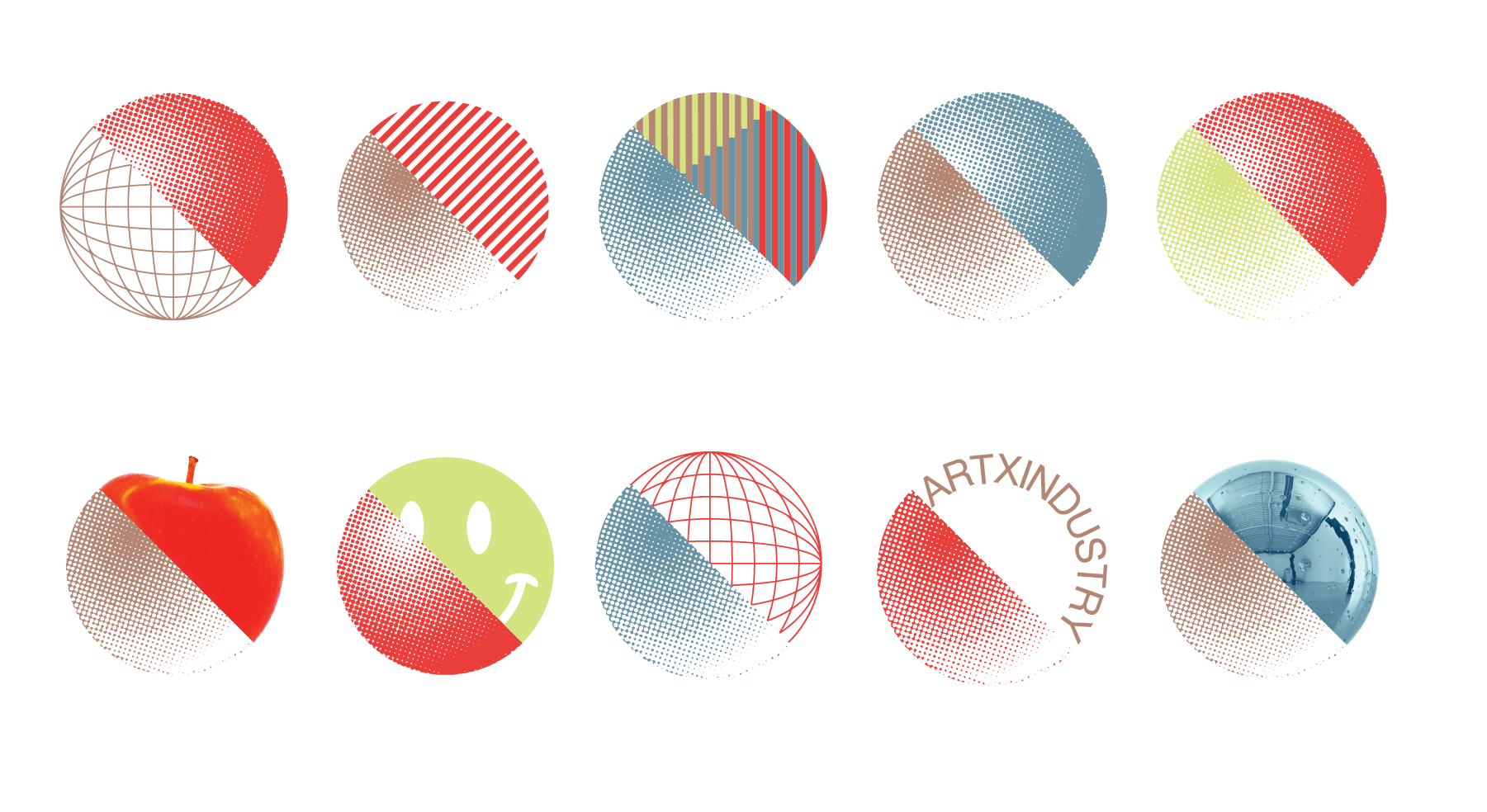
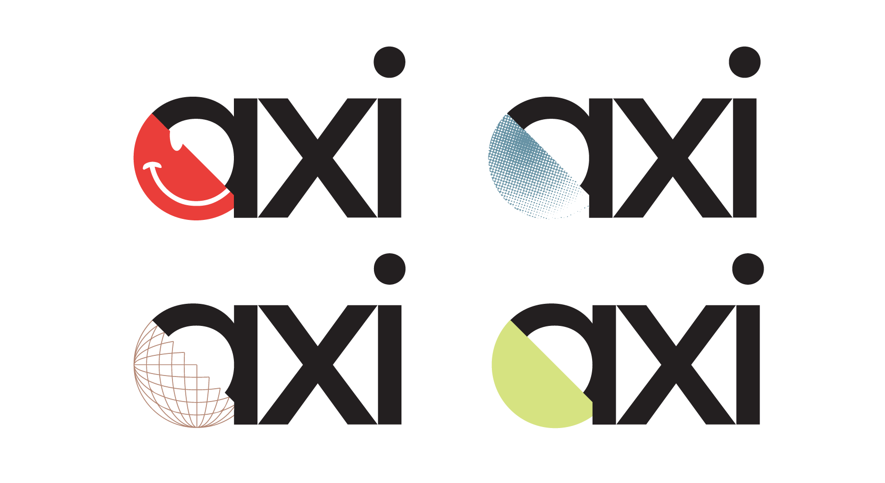
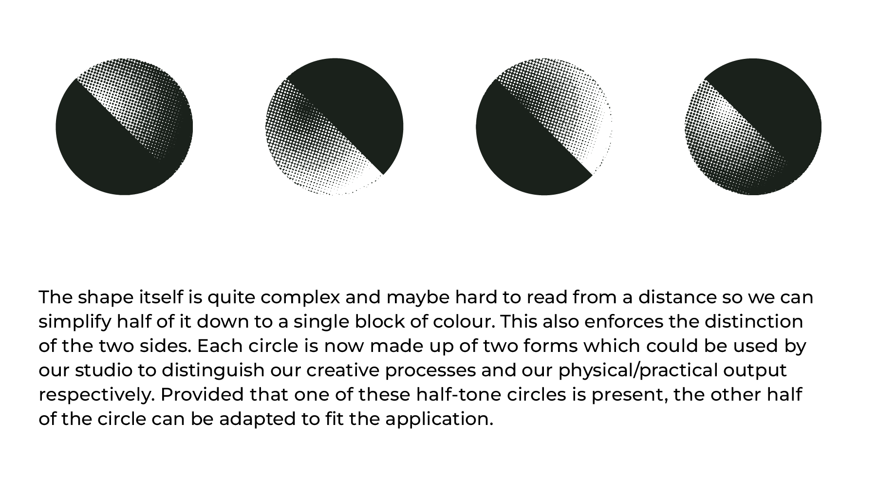
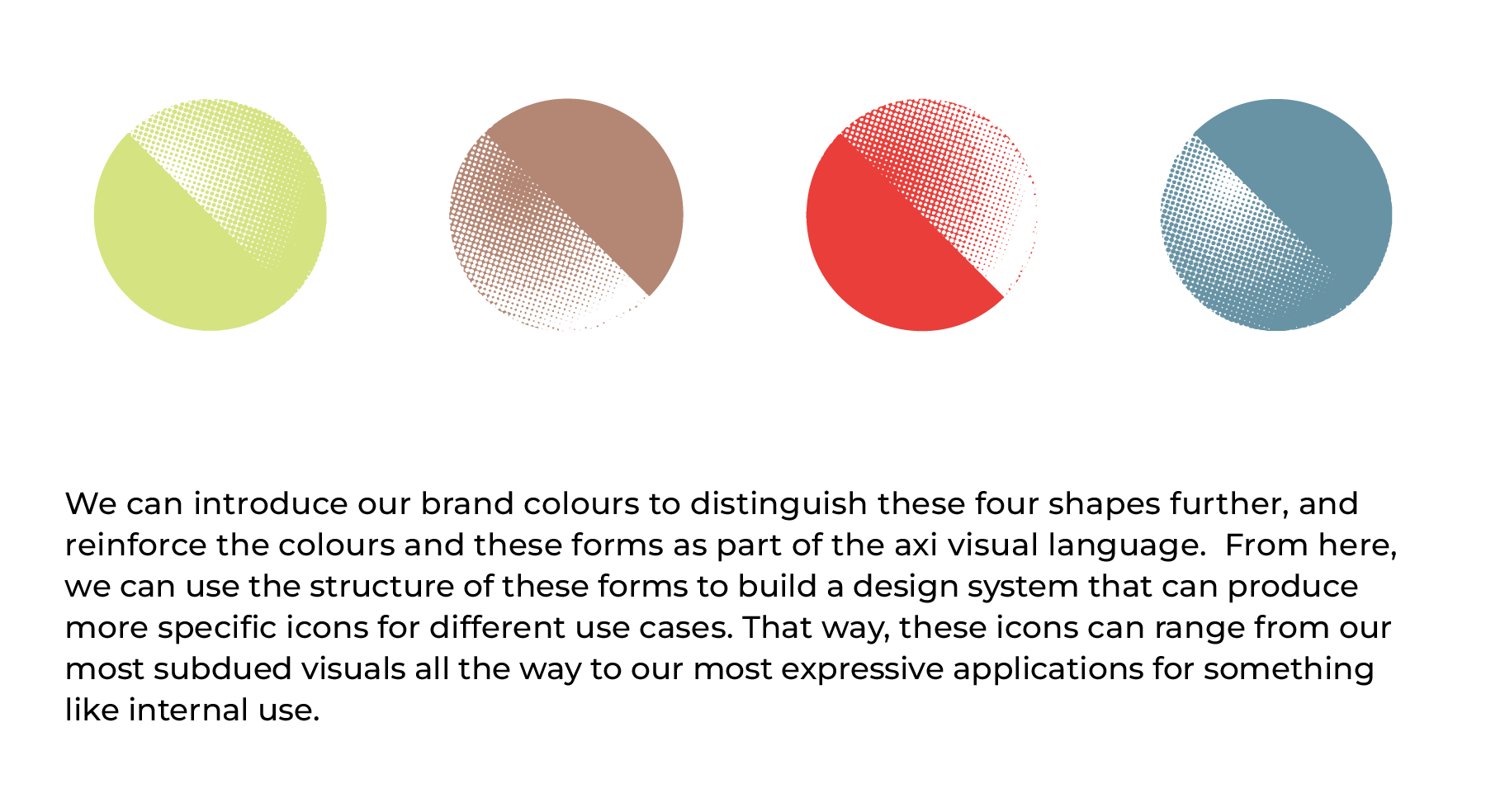
Modular Icon Concept
This pitch took place pre-launch and was not introduced as it was decided that we opt to use only the two primary colours so that our case studies and other highlighted work could be displayed without obstruction. The concept was recycled for use in the brand's launch event apparel.
Colours &
Stationary
Stationary
The supporting assets developed after the fundimental branding was confirmed. Stationary for communication and promotions.


SDGC/artxindustry
Signage & Wayfinding
Signage & Wayfinding
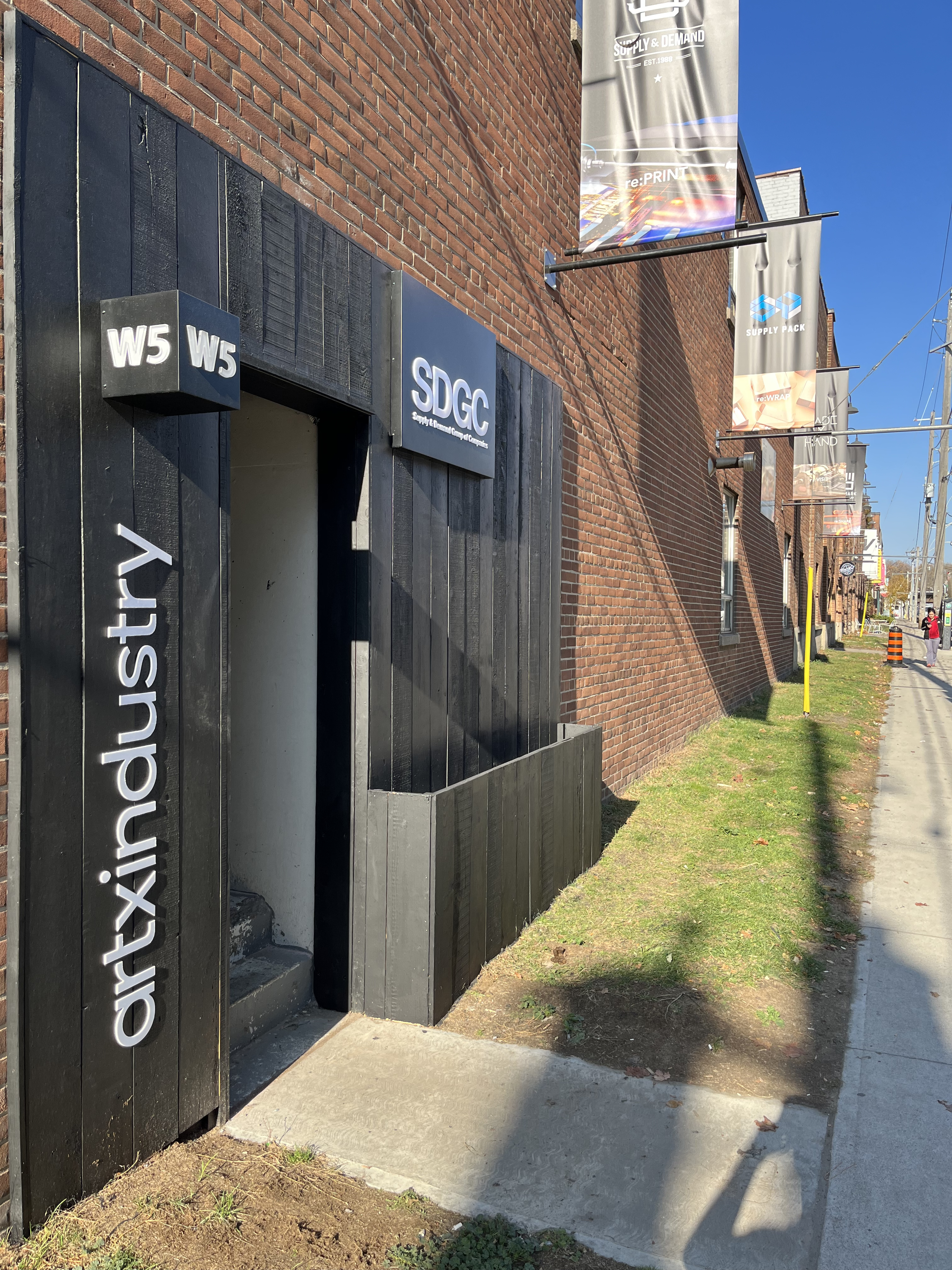
I was tasked with redesigning the entranceway to our building to highlight artxindusty’s addition to the suite of offices and our partnership with SDGC.
I designed the exterior to have black panels to fit the look of the interior office space and added the W5 unit number box to highlight our location as we had had issues with clients not being able to find our office. I also updated and systemized the side of building banners to appear more as a cohesive set each highlighting one of the businesses that shared our offices space in the building.
I designed the exterior to have black panels to fit the look of the interior office space and added the W5 unit number box to highlight our location as we had had issues with clients not being able to find our office. I also updated and systemized the side of building banners to appear more as a cohesive set each highlighting one of the businesses that shared our offices space in the building.
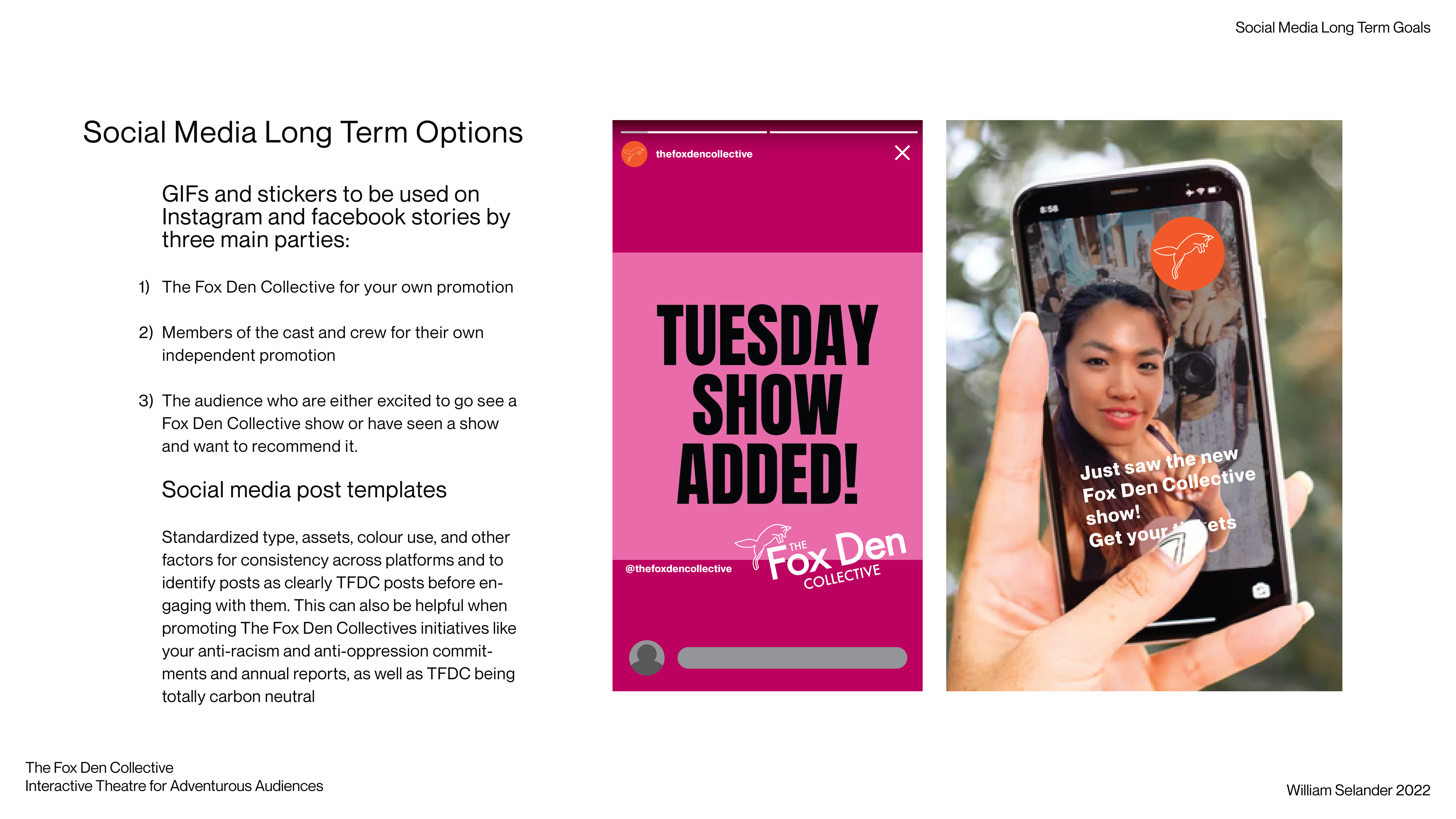
Playful, cunning, and slick! The Fox Den Collective deights in crafting their plays with exploration and audience choice on centre stage. Their plays extend beyond the bounds of a traditional stage play and instead take place in venues ranging from entire neighborhoods with multiple stops, to a whodunit taking place all in breakout rooms of a zoom call. The many facets of this branding are all intentioned to evoke excitement, exploration, and engagement.



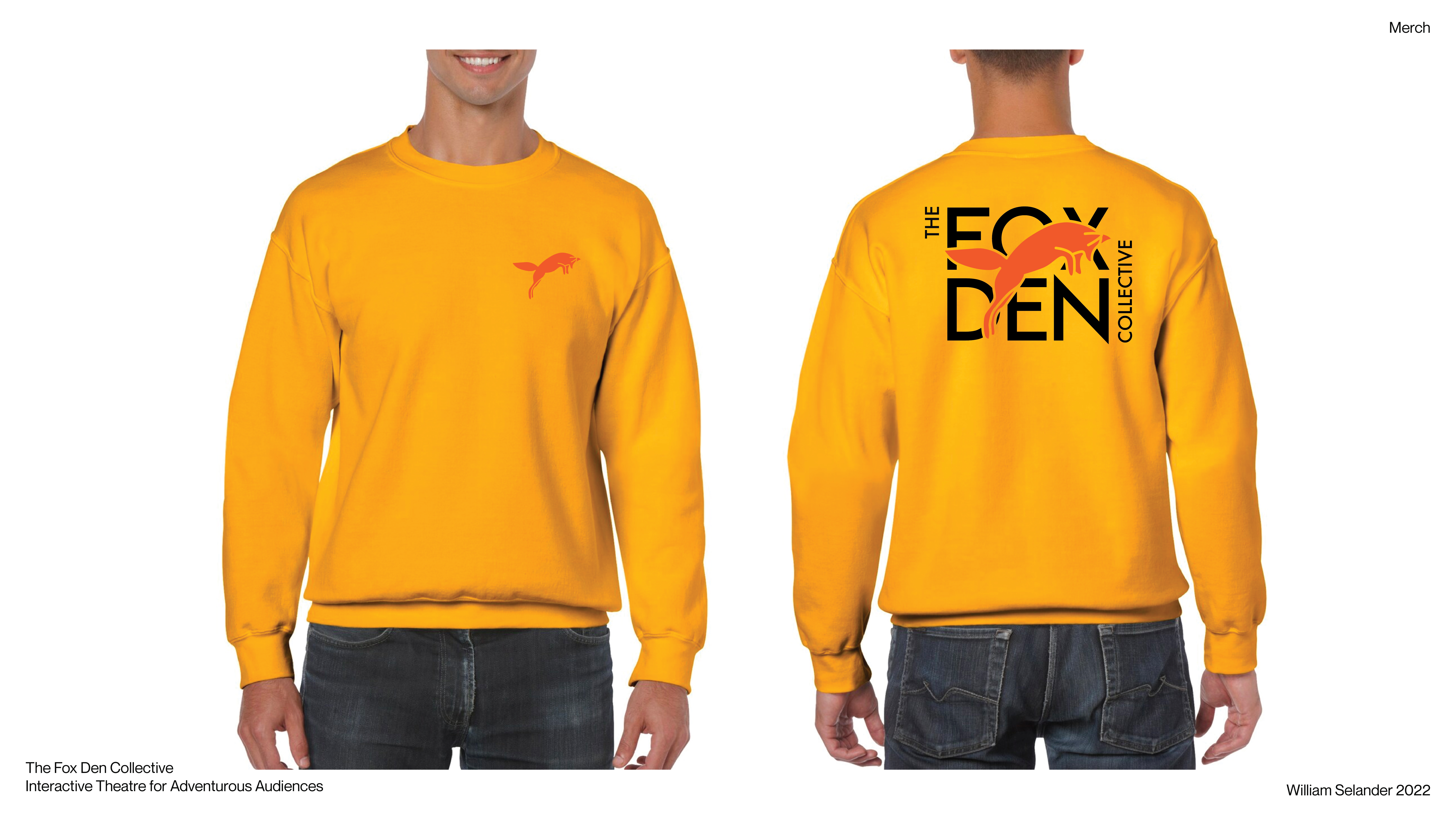
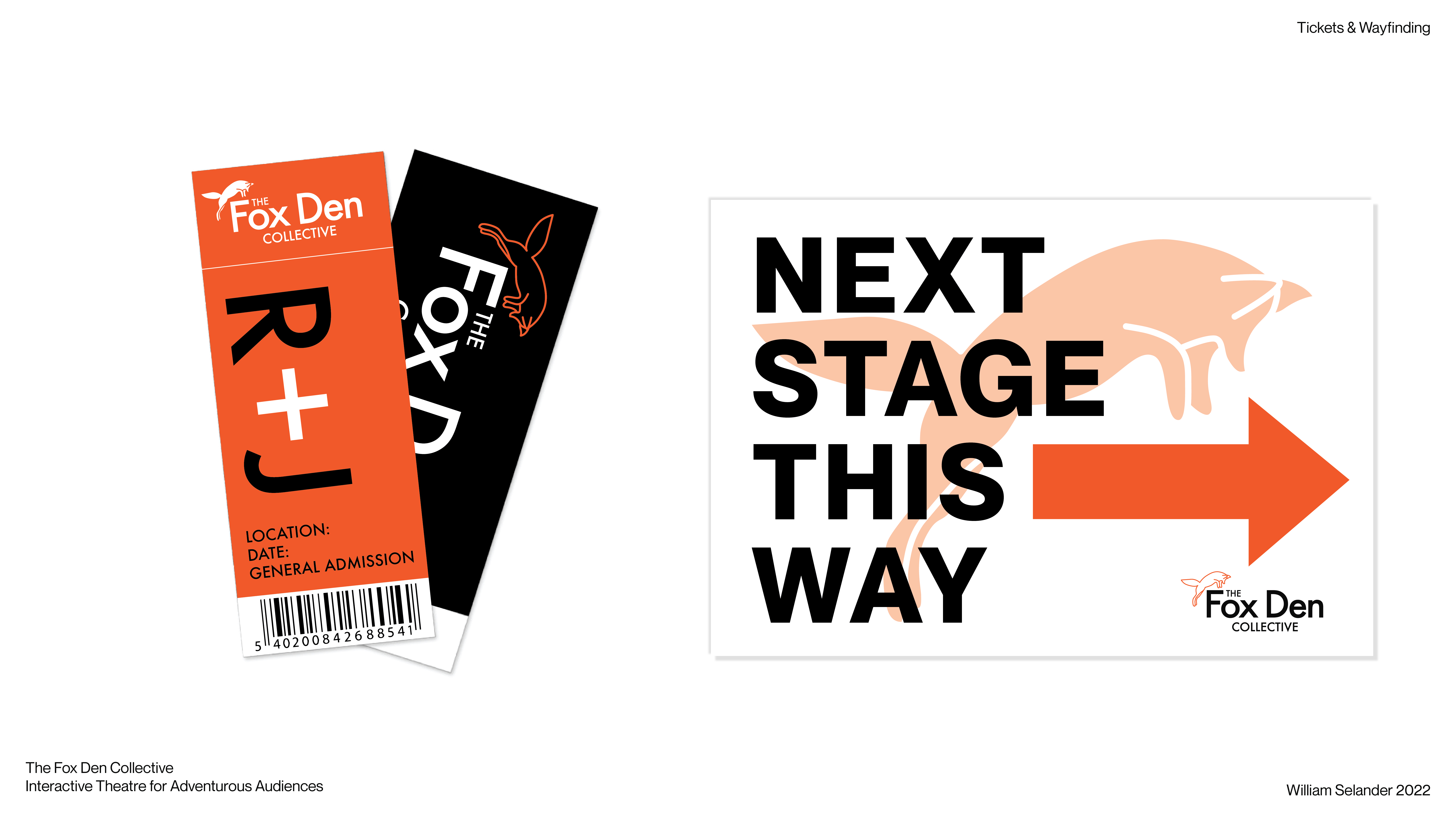


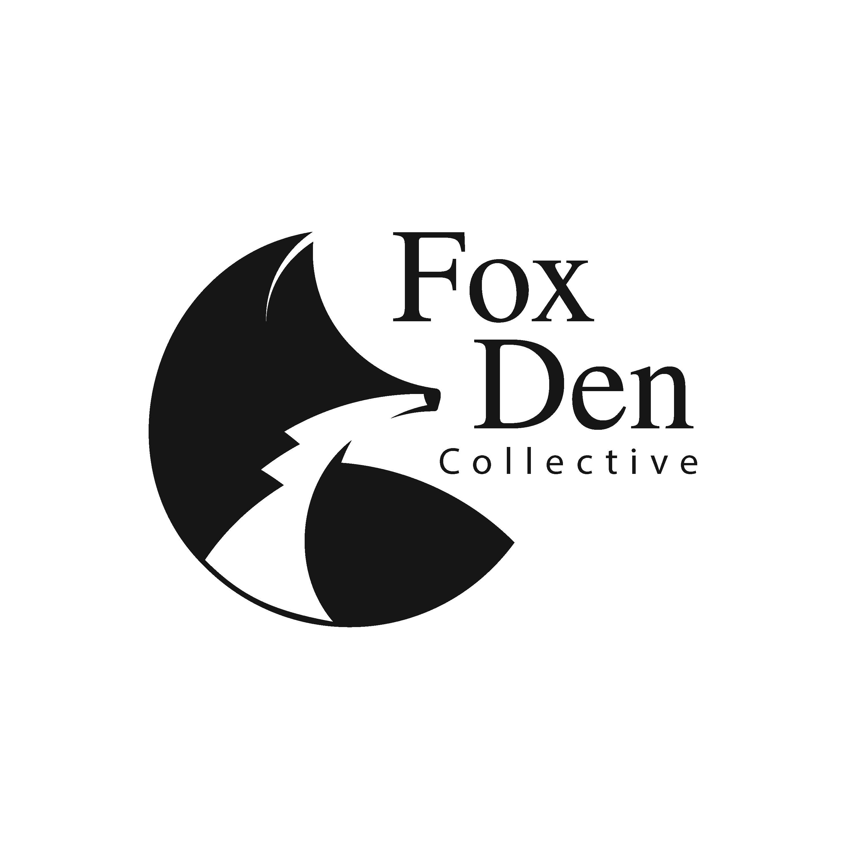

These are the initial 2019 logos that were pitched shortly after the Fox Den Collective produced and showed their first, interactive, audience led play Off’d on Whyte.